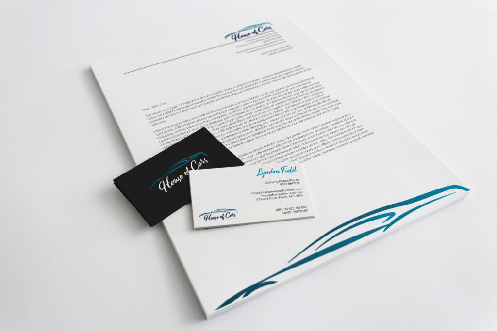
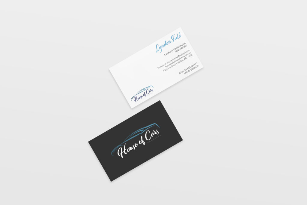
The House of Cars asked if I could design their logo, plus a business letterhead and business cards.
The businesses major selling point are the medium to high end used cars. So, the aim was to keep the design sophisticated but also show some character.
The car is represented through the sleek and smooth lines and the main font also follows this style. The secondary font (used for body text) compliments and contrasts the Display fonts with its thin lines, sharp cornering and san serifs.
